Bento Grid Layout Design Template: Merging Structure with Creativity
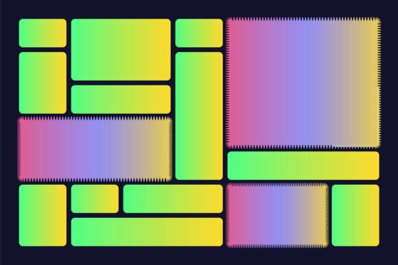
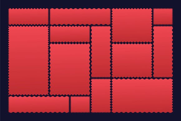
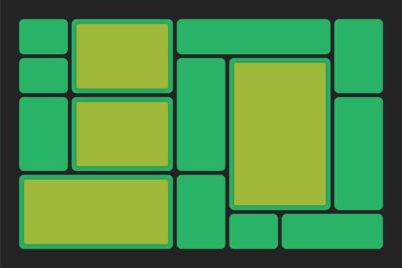
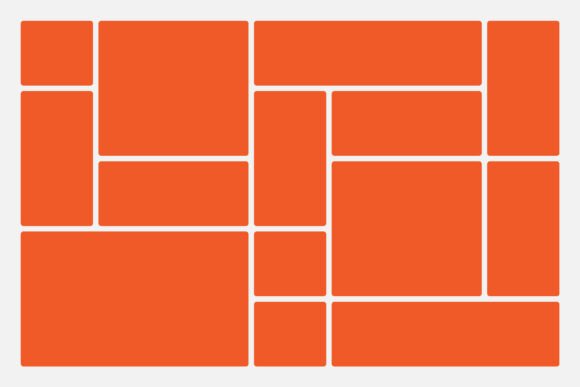
The Bento Grid Layout Design Template represents a modern approach to visual composition, blending modular structure with creative freedom. Originally inspired by the Japanese Bento box, this layout style organizes content into a grid of distinct, often asymmetrical sections, each capable of housing different media types. Unlike rigid column-based systems, the Bento Grid encourages asymmetry and dynamic arrangements while maintaining a sense of balance and coherence. This design philosophy appeals to those who seek both organization and visual interest in their digital or print layouts.
What Sets the Bento Grid Layout Design Template Apart?
At its core, the Bento Grid Layout Design Template is defined by its use of compartmentalization. Rather than flowing content linearly, this template divides space into a series of cells or boxes, allowing designers to assign specific elements—text, images, buttons, or icons—to individual units. The result is a visually engaging layout that guides the viewer’s eye through varied focal points without overwhelming the senses.
Unlike traditional grid systems that emphasize uniformity, the Bento Grid embraces intentional irregularity. This makes it especially effective for portfolios, dashboards, editorial pages, and landing pages where variety and visual hierarchy are key. The geometric underpinnings of the template ensure that even with asymmetry, the overall design remains cohesive and structured.
Comparing the Bento Grid with Other Layout Approaches
When evaluating layout design systems, it's important to understand how the Bento Grid stacks up against alternatives. Let's explore some common design approaches and how they compare:
- Column Grids: These are the most widely used in web and print design. While they offer consistency and ease of implementation, they can feel predictable and lack visual excitement. The Bento Grid, by contrast, introduces flexibility and spatial variety without sacrificing order.
- Freeform Layouts: These allow complete creative freedom but often risk appearing chaotic. The Bento Grid offers a middle ground—creative flexibility within a defined framework.
- Masonry Layouts: Common in gallery and blog formats, masonry layouts stack elements vertically based on content height. They’re visually engaging but can become cluttered. The Bento Grid maintains clearer spatial boundaries, making it easier to manage visual hierarchy.
- Card-Based Layouts: Popular in modern UI design, card layouts are modular but tend to be uniform in size and placement. The Bento Grid allows for more variation in box dimensions and positioning, offering a richer visual experience.
When the Bento Grid Layout Design Template Excels
The Bento Grid Layout Design Template shines in situations where content variety and visual storytelling are priorities. It works exceptionally well for:
- Portfolio Websites: Designers, photographers, and creatives can showcase different types of work in a single, visually engaging layout.
- Dashboard Interfaces: The modular nature of the Bento Grid makes it ideal for organizing data, tools, and metrics in a way that’s both functional and aesthetically pleasing.
- Editorial Pages: Newsletters, magazines, and blogs benefit from the Bento Grid’s ability to highlight multiple story formats—headlines, images, summaries—without visual monotony.
- Landing Pages: Marketing and product pages can use the Bento Grid to guide user attention through a mix of calls-to-action, testimonials, and features.
Tradeoffs and Limitations to Consider
While the Bento Grid offers many benefits, it’s not without its limitations. Designers and developers should consider the following tradeoffs:
- Complexity in Responsive Design: Adapting the Bento Grid for mobile screens can be challenging due to its asymmetric structure. It may require more careful planning and breakpoints than a standard column grid.
- Content Density: If not carefully managed, the Bento Grid can become visually dense or overwhelming, especially when too many elements are included in a single view.
- Accessibility Considerations: Screen readers and assistive technologies may not interpret the layout as linearly as column-based designs, so semantic HTML and ARIA roles must be used thoughtfully.
- Development Time: Implementing a custom Bento Grid may take longer than using a standard layout system, particularly when dealing with dynamic or CMS-driven content.
Deciding When to Choose the Bento Grid Layout Design Template
Choosing the right layout system depends on your project’s goals, audience, and technical constraints. Here are some decision factors to help determine whether the Bento Grid Layout Design Template is the right fit:
- Creative Expression: If your project benefits from a unique visual structure that breaks away from standard layouts, the Bento Grid can help differentiate your design.
- Visual Hierarchy: For projects that require guiding the viewer through multiple focal points, the Bento Grid’s compartmentalized approach can enhance readability and engagement.
- Brand Identity: Brands with a modern, artistic, or playful tone may find the Bento Grid aligns well with their visual language.
- Technical Resources: If you have the time and expertise to handle responsive design challenges and accessibility concerns, the Bento Grid can be a rewarding choice.
Real-World Examples and Practical Applications
Let’s look at a few scenarios where the Bento Grid Layout Design Template has been effectively applied:
- Photography Portfolio: A photographer might use the Bento Grid to display a mix of full-width images, square thumbnails, and text overlays that tell the story behind each shot. This approach adds rhythm and depth to the page.
- Startup Landing Page: A SaaS company launching a new product might use the Bento Grid to highlight features, customer testimonials, and video demos in a visually engaging way that avoids the monotony of standard hero sections.
- Newsletters: Email designers have adopted Bento-style layouts to create visually dynamic newsletters that blend headlines, images, and links in a way that feels less rigid than traditional email templates.
Final Thoughts on the Bento Grid Layout Design Template
The Bento Grid Layout Design Template offers a compelling alternative to conventional layout systems. By combining modular structure with creative flexibility, it enables designers to craft visually rich and functionally effective interfaces. However, like any design tool, it’s not a one-size-fits-all solution. Understanding its strengths, limitations, and ideal use cases will help you make a more informed decision about whether it aligns with your project’s goals.
Whether you're exploring design templates for a personal website, a brand campaign, or a user interface, the Bento Grid presents a unique opportunity to blend form and function in a way that feels both intentional and expressive. As with any design approach, the key is to use it thoughtfully—ensuring that creativity serves purpose, and that structure supports usability.